Johnny Rooster Style Guide

Johnny Rooster is a superstitious baseball player with a lot on his mind.  Johnny, originally created for a clothing line, became a character I used for a number of comic strips.  This body of work includes style guide sheets and some examples of the comics, ranging from single image, daily strips, and a sunday strip.

Daily Series: The Wrong Halloween

After watching Nightmare before Christmas when it first came on to Netflix, I started thinking about who these characters could “dress-up” as for Halloween. I found that quite a bit of them go well with Batman’s rogues gallery, and so the fun ensued.

These works are part of my Character Chop Shop daily sketches.
Joker Jack
Poison Sally
Finkelstein Freeze
Clayface Boogie
Mayor Two-Face

Dark Side Over The Rainbow

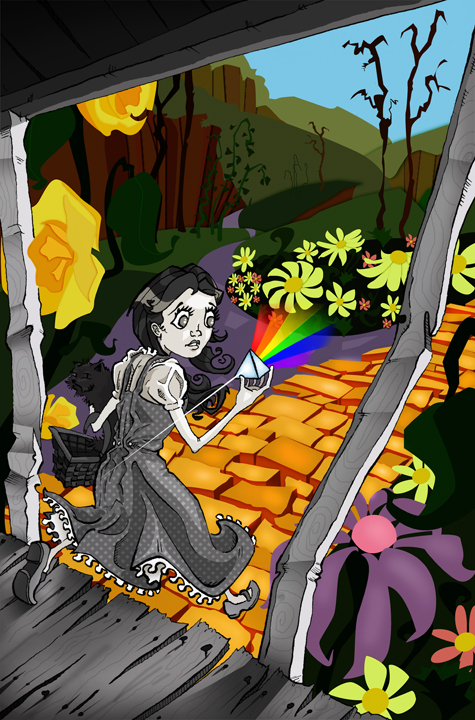
This piece was once a quick daily sketch that I had done for the blog I started at PC with some students in the illustration department.

The story behind it comes from Pink Floyd’s album, Dark Side of the Moon, and the theory that it syncs with the Wizard of Oz.  I wanted to capture that idea in a single image without relying on sound or text, so I found that incorporating the album cover’s prism and rainbow would coincide perfectly with the scene where the film turns from black and white into color.

I wanted there to be a distinct look between the two worlds, yet show that they can exist together, so the black and white part of the image is done with line-work and digital shading while Oz is created from colored shapes that make up Munchkin land.

The title of this is again a combo of the album and the movie. The scene that is referenced in my image is just before Dorothy sings “Somewhere Over the Rainbow,” which speaks to the transition to color and the rainbow coming from the prism in her hand.


Mariachi Party

The characters and matter of creating a mariachi band were sprung from ideas for a birthday party with hot pepper invites, armadillo cake, featuring a mariachi band.  Those were ideas being tossed around for a birthday party that I was asked to help develop an invitation for. This poster became that project instead and was featured at the event.


Vesper

Capt. John’s Hops Cannon

The illustration was developed for a beer label for a gentleman named Steve Witt. Steve creates his own batches of brew, and for this one in particular he wanted the likeness of someone he knows (John). Although this illustration is what Steve used for his own labeling system (sans type), I wanted to create a version of my own for a can.

Red Cross

I wanted to create a set of images that might inspire someone to go do something good.  I landed on doing a set of ads for Red Cross that takes true stories and puts them into form.  Each image is a blood line that tells the true story of the person who was saved by donors.

BlindSided

This was my take on an article I found in GQ magazine about a young man who’s identity came into question after becoming a high school basketball star.  I modified the page design slightly, but I wanted to try and create this editorial illustration within the confines of the magazine’s current design.

Mike Haftel

This mark was commissioned by Mike Haftel, a creative who studied at the Creative Circus in Atlanta.  Mike wanted a mark to represent himself that has elements (such as the tentacles) that could carry throughout his book.

Killebrew Rootbeer

Character development project based on Twins player Harmon Killebrew.  These were used to present a new direction for Killebrew Rootbeer, a top seller at Target Stadium.