Moto Z to A

I had the pleasure to work as one of the illustrators on the A to Z campaign for the Moto Z Droid. This campaign was a showcase of the creative things people can do with the phone and available mods. Each letter was brought to life in animation; many by South African studio, Am I Collective. My letter (T) focused on the Power Pack mod.

“Travel on one charge. In a snap. A road trip essential – Moto Z Droid + TUMI Power Pack.


Vector

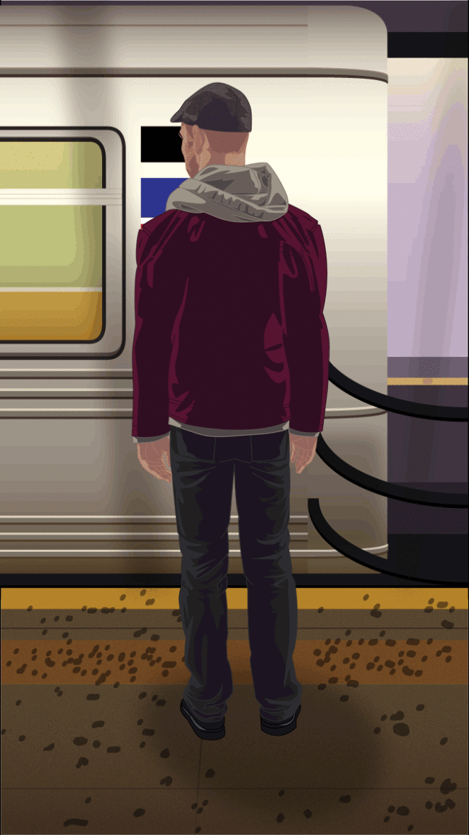
Stand Clear (gif)

(Click if not moving)

Subway


OCT 21 2015

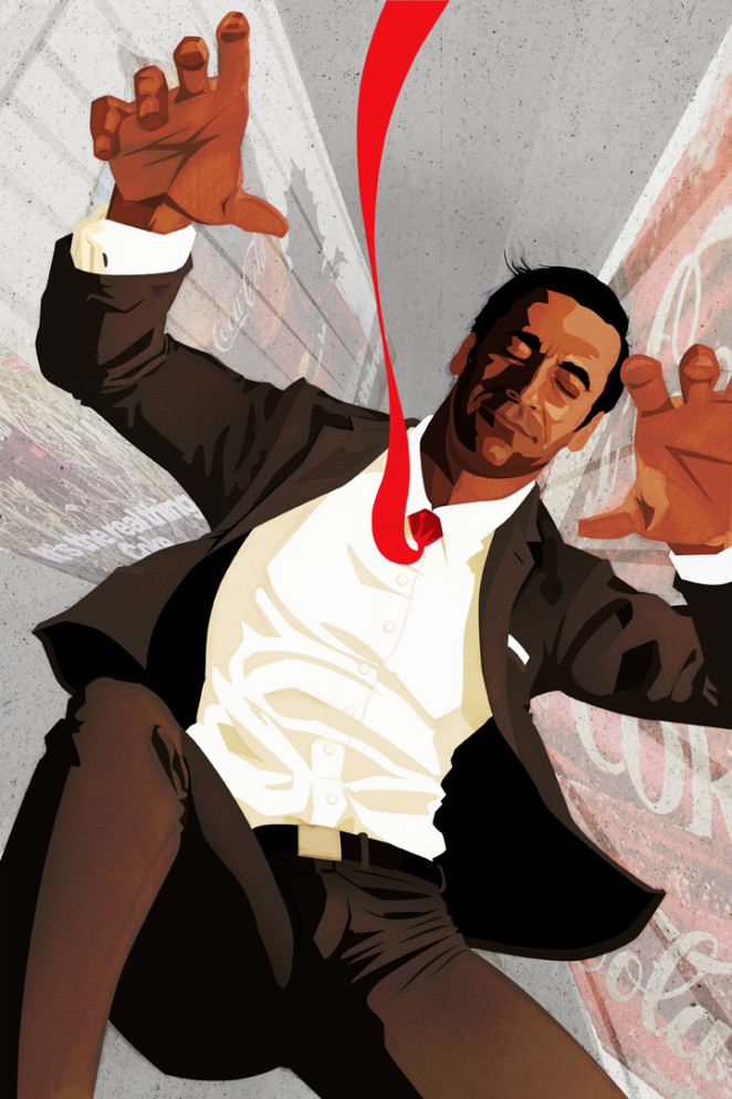
Happiness (Mad Men Finale)

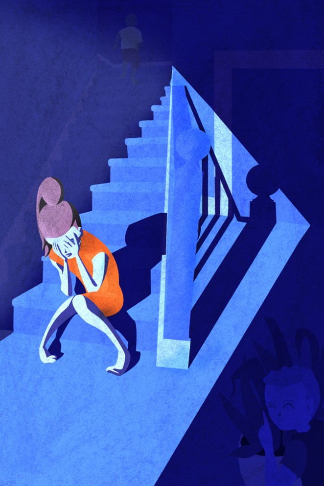
Give it another look…

What do you see?  What kind of mood does this image give off?  Well, give it another look.  This image is called Hide & Seek.  The point of this image is to let you tell the story of what is happening and feel a certain way.  However after looking closer at what is happening in the image, you should think and feel something entirely different!

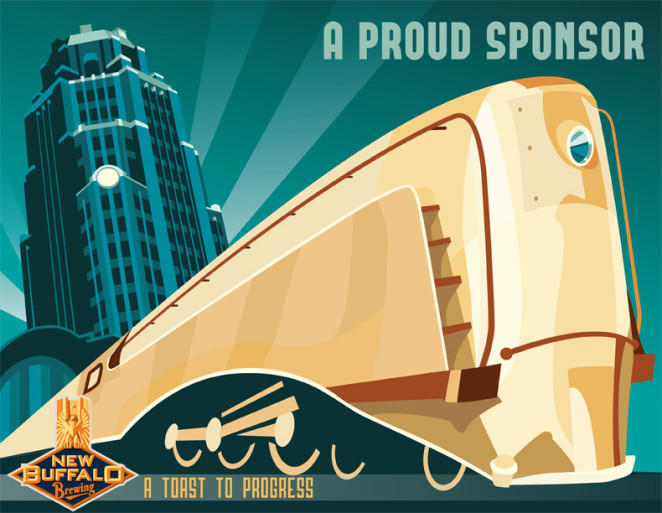
New Buffalo Brewing Co.

The New Buffalo Brewing Co. is an up and coming brewery in Buffalo, NY started by William Campbell. I’ve not had the chance to try any of their brews yet, but I’m happy to contribute work to the New Buffalo Brewing imagery. Check out what they have coming at http://www.newbuffalobrewing.com/

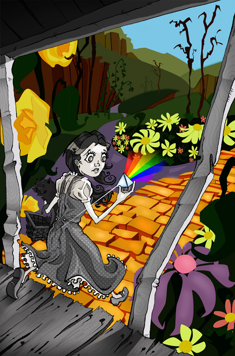
Dark Side Over The Rainbow

This piece was once a quick daily sketch that I had done for the blog I started at PC with some students in the illustration department.

The story behind it comes from Pink Floyd’s album, Dark Side of the Moon, and the theory that it syncs with the Wizard of Oz.  I wanted to capture that idea in a single image without relying on sound or text, so I found that incorporating the album cover’s prism and rainbow would coincide perfectly with the scene where the film turns from black and white into color.

I wanted there to be a distinct look between the two worlds, yet show that they can exist together, so the black and white part of the image is done with line-work and digital shading while Oz is created from colored shapes that make up Munchkin land.

The title of this is again a combo of the album and the movie. The scene that is referenced in my image is just before Dorothy sings “Somewhere Over the Rainbow,” which speaks to the transition to color and the rainbow coming from the prism in her hand.


Capt. John’s Hops Cannon

The illustration was developed for a beer label for a gentleman named Steve Witt. Steve creates his own batches of brew, and for this one in particular he wanted the likeness of someone he knows (John). Although this illustration is what Steve used for his own labeling system (sans type), I wanted to create a version of my own for a can.

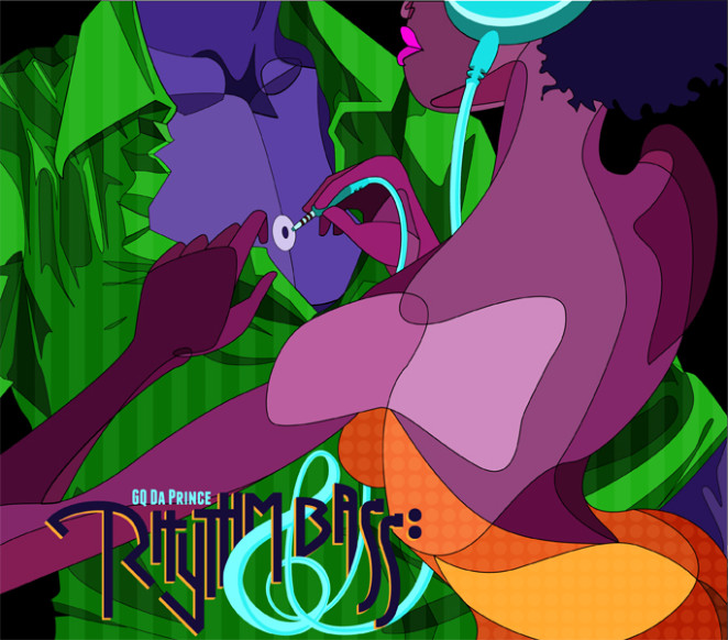
Rhythm & Bass

This is the cover art of the album Rhythm & Bass by an R&B artist located in Queens who goes by the name of GQ Da Prince.

I wanted to try something new, so it was fun to experiment. This direction spoke to me most in terms
of what his work is about, and what it means as not only a musician but an artist to pour your heart into
everything and allow someone in to experience what has been created.

Feel free to check out some of his music that inspired this piece.

https://soundcloud.com/gqdaprince